Tuesday, September 29, 2009

Felix the Cat


Felix the Cat cartoons first made an appearance in 1919 and became instantly popular. These cartoons were "silent" in that the characters did not speak and only music was played. Textual synopses were also displayed for the audience to read in order to know what was going on in the plot. Felix creator Otto Messmer & illustrators Joe Oriolo & Don Oriolo are credited with the production of the Felix cartoons that led to their popularity. It's really interesting to see what animation and cartoons were like in the 1920s...below are examples of these cartoons courtesy of YouTube.

Here is the very first Felix the Cat cartoon which came out in 1919 and is called "Feline Follies."


Here is a Felix the Cat cartoon from 1922 entitled "Felix Saves the Day."


kristen

sources:
http://en.wikipedia.org/wiki/Felix_the_cat
http://www.felixthecat.com/

Sunday, September 27, 2009

Duchamp + Dada = Art?


Marcel Duchamp, a french artist born on July 28 1887, was an important figure in the so-called "Dada" movement that started during the time of World War I and peaked from 1916-1922. Dadaism was a cultural movement that began in Switzerland and eventually spread throughout Europe and later expanded in the western culture. Dadaism corresponded to the outbreak of World War I and to many was a protest against the bourgeois nationalist and colonialist interest which to the Dadaist was believed to be the root cause of the war.

Dada was not art, it was "anti-art." For everything that art stood for, Dada was to represent the opposite. Where art was concerned with traditional aesthetics, Dada ignored aesthetics. If art was to appeal to sensibilities, Dada was intended to offend.

Marcel Duchamp work all started in 1912 while he was apart of the surrelalism/cubism movements. In the year of 1912 Duchamp would create a cubist-inspired technique for depicting motion, then move on to something that wasnt well known called "abstract painting". "Nude Descending a Starcase" was trying to show a human figure in motion in a cubist style. There is nothing in it that resembles an anatomical nude but instead is made up of abstract lines and planes. The abstract lines are there to support a sense of rythmic "motion" when this art peice came out, it was very confussing to the viewer on how to predict what here was actual going on.


Duchamp's next big project in 1915 coined the term "readymades". "Bicycle Wheel" was the first of a class of objects of a total of 21 of them from the years 1915-1923. These were already pre-made objects that everyone was familiar with that he changed the view of them in some certain way to make make the viewer think abstractly about whats going here. These "readymades" broke every rule of the artistic tradition in a way for Duchamp to create a new kind of art. Was this really art though? some say "yes" and some say "no", its just how you as the viewer applies to the thinking behind it.


Marcel Duchamp was a playful man who challenged conventional thought about what is actual art? Duchamp's famous and very controversial art piece, "Fountain" was displayed in 1917 at an art show. It was a urinal turned upside down or tilted with the signed name "R. Mutt" printed on it. This type of so-called art was called "ready mades" by Duchamp. Even though the art show where Marcel submitted the urinal said "all works would be accepted", the "Fountain" was never actually displayed and soon later got lost. Art or non-art this piece became one of the major landmarks that was thought to influence "surrealism" later down the road during the 20th century.


-Paul Miller


Sources:


Monday, September 21, 2009

The Unsinkable Titanic

In April 10th, 1912, the RMS Titanic began it's maiden voyage from England to New York, carying 2,223 people aboard it's luxurious interiors. Deemed unsinkable by it's creator's, it was unthinkable of the tragedy that would strike on the late Sunday evening of the 14th. Were the flaws truely the vessel in question, or of the boastering and pride of the wealthy and creator's of the vessel. In the end, the tragic losses from the event shook the world and changed their thinking about safety and passenger sizes.


The Titanic was designed to be unsinkable, having several compartments along the ship that would close off in case of flooding. A few flooded compartments would allow the ship to remain afloat. However, the nature of the impact with the ice burg caused it to tear at one side of the hull, cracking open far more compartments to the bitterly cold water. The impact and cold weather caused the hull to buckle, and allowed more water in that what could be blocked off. One theory was that if the ship had impacted the iceberg head on, that it would have stopped the ship entirely in it's tracks, but would have remained afloat, saving thousands of lives.

The sinking of the titanic was one of the biggest peacetime Maritime Disaster. It's event shook the world, and caused great changes in the laws of how ships were regulated upon open water. Specifically, the inclusion of life boats that would accompany all number of passengers on said ships. The Titanic had enough space on it's life boats for 1,178 people, with a ship wide capacity for over 3,000. By today's standards, this is appalling. The tragedy became a forever reminder about the dangers of the ocean, and better preparations in the case of the worst occurring.

In 1985, the Titanic was discovered by a joint effort between American and French scientists.


EAK

Sources:
http://en.wikipedia.org/wiki/RMS_Titanic
http://home.att.net/~wormstedt/titanic/
http://chandrakantha.com/articles/indian_music/filmi_sangeet/film_song_1985.html
http://www.titanic-titanic.com/discovery_of_titanic.shtml

Sunday, September 20, 2009

It's Mucha Style


Art Nouveau, french for "new art", was a new international style of art introduced at the turn of the 20th century (1890-1905) in the streets of Paris, France. The movement was strongly influenced by Czech artist Alfons Mucha. Alfons Mucha produced a "lithographed" poster, which appeared on January 1, 1895 in the streets of Paris as an advertisment for the play Gismonda by Victorien Sardou. Thanks to this, Mucha became an overnight sensation as he announced the new artistic style to the citizens of Paris. At first the new style of art was called "Mucha Style" but soon became known as Art Nouveau.

The 1900 Universal Exhibition in Paris spread the "Mucha style" internationally, of which Mucha said "I think the exposition universally made some contribution toward bringing aesthetic values into arts and crafts."

Art Nouveau can be characterized by organic, especially floral and other plant-inspired motifs, as well as highly-stylized, flowing curvilinear forms.
By the time of his death on July 14 1939, Mucha's style was considered outdated. However, his son, Jiří Mucha, devoted much of his life to writing about him and bringing attention to his art. Interest in Mucha's distinctive style experienced a strong revival in the 1960's and is particularly evident in the psychedelic posters of Hapshash and the Coloured Coat, the collective name for two British artists, Michael English and Nigel Waymouth, who designed posters for groups such as Pink Floyd and The Incredible String Band.
Hapshash and the Coloured Coat-Pink Floyd/Jimi Hendrix


Sources:
-Paul Miller


Sunday, September 13, 2009

Comic Books :)


Comic Cuts with some Illustrated Chips (1890)
It was on May 17, 1890 when an artist by the name of Alfred Charles William Harmsworth, introduced a brand new generation of comic books that would forever change the way we look at comics. All though it actually wasn't the first comic, which goes to Ally Soper's Half Holiday, it was Harmsworth's Comic Cuts (3006 issues) and Illustrated Chips (3003 issues) a few weeks later on the 26th July 1890 that started the whole "comic-boom" in Britain. These were the comics that set the benchmark of how comics were to look for the next half a century. But more importantly, these comics and their subsequent imitators were an outlet for the many talented artists and writers that were looking for work.

The one overwhelming factor for the success of these two comic-papers was it's price. At just ½d (half-penny) it was half the price of most of the other publications of the time. However, newsagents were worried that if these half penny papers were successful then no one would buy the penny ones. Harmsworth retorted that if newsagents would not handle halfpenny papers he would appoint his own agents who would. Harmsworth's editorial from the very first issue of Comic Cuts goes some way to explaining how he proposed to make a success of such a low-cost paper and how he hoped "it would grow until it was as well-known as our excellent friends Scraps and Sloper". Notice how the term "comic" still hadn't been coined, Comic Cuts was considered to be a paper and it wasn't until the following year that the colloquialism comic had become common usage.


Comic Cuts and Illustrated Chips changed the way we look at entertainment through images of cartoon animation that laid a pathway for other future cartoonist to follow.


Sources:

www.comicsuk.uk/History/Historywhole.asp

-Paul Miller

The Wright Stuff.


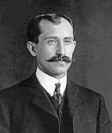
Would you ever consider the Bicycle to be a precursor to the airplane? In 1903, Wilbur and Orville Wright changed the world of travel with a small number of inventions. Mainly, the first practical fixed-wing aircraft, the three-axis system, and just as important, first successful flight by 'people without wings.'

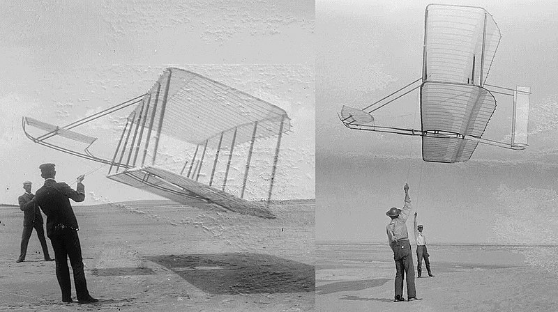
Starting out as a printing press at 1889, and taking advantage of the bike craze in 1892, both brothers only began their thoughts and experimentation with flight when gliders, and their rider's unfortunate deaths, became big news. As they began work, making gliding possible, but also safety was their first goal. Whenever they tested, they put weights of sandbag in the place where a rider would go.


After successful test glides in 1901 and 1902, they began work on a craft that could hold flight on it's own. To do this, they had to devise their own motor that was light weight, and powerful enough to run the turbine that could help keep the flying machine lifted. Kitty Hawk beach in North Carolina was their best testing ground because of the high winds that the area provided.

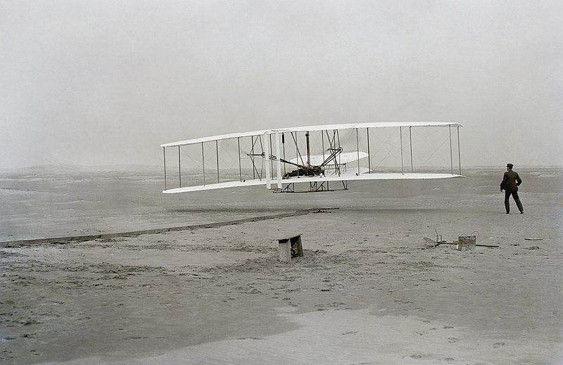
On December 17th, 1903, Orville flew the Wright Flyer I four times, the longest flight being 59 seconds and going 852 feet. This success helped to start to change the world as flying became the quikest means of travel for great distances today.


Erik

Sources:
http://www.eyewitnesstohistory.com/wright.htm
http://en.wikipedia.org/wiki/Wright_brothers

Saturday, September 12, 2009

Those crazy-big bicycles

Originally called a "dandy horse", the Victorian bicycle with it's stereotypical huge front wheel and tiny back one was invented in 1814 by the German-born Baron Karl von Drais. His idea was to have a vehicle that could be pedaled at the front wheel in a forward motion with the feet, with a front wheel that pivoted and a handlebar for steering. The Baron introduced it to England, where it became “the thing to have”of the day! It came to the United States by 1819, but interest in it almost died until until 1840, when someone decided to put cranks on the rear wheel axle, which connected it to the pedals by driving rods. It was a hit!


The first bicycles were made almost entirely of wood, until a Frenchman, Lallement, replaced the wooden wheels with iron in 1865. This was the first real "bicycle", although because it was almost always ridden on cobblestone it was also called a "boneshaker". Later designs had rubber wheels with a higher front wheel for a smoother ride.

The following is a quote from here: http://victorianbazaar.com/bicycles.html

"By 1870, ingenious high wheel models, such as the first all metal bicycle appeared with solid rubber tires and long spokes. One of the bicycles of that period was called “the Ordinary”. Gradually, its front wheel was enlarged for a smoother ride,

Bicycles evolved during the 19th century as advances were made in mettalurgy that allowed for them to be made with lightweight metal designs. and the rear wheel reduced for speed. It eventually had a 40-48 inch front wheel for farther travel and a 16-inch rear wheel! One high wheeler even had a front wheel of 64 inches! The phrase, “taking a header” was coined when the rider was stumbled by a sudden necessity to stop, and fell forward to the ground landing on his head! But this risk didn’t stop anyone! Even the women in their long dresses and tight corsets wanted to “get in on the fun”. They were riding around on another invention, the high wheel adult tricycle! This mechanical version also became popular with the more dignified gents who were doctors and clergymen.

By the 1880’s, the “two wheeler” (bicycle) was tremendously popular, especially with the younger men who had the money to pay for it. A bicycle could cost as much as $150 (about six month’s pay) at that time.

Blanche

http://www.victoriana.com/directory/bikes.html
http://victorianbazaar.com/bicycles.html
http://antiques.lovetoknow.com/Victorian_Bicycles

Friday, September 11, 2009

Jack the Ripper


Through the dark, foggy, ere nights of the Whitechapel area and adjacent districts of London in late 1888 came a "monster" serial killer known as Jack the Ripper. These events all occurred during the Victorian Era in the United Kingdom during Queen Victoria's reign. He comes from out of the fog, kills violently and quickly, and disappears without a trace. Then, for no apparent reason, he satisfies his blood lust with ever-increasing ferocity, culminating in the near destruction of his final victim, and then vanishes from the scene forever. Jack the Ripper targeted prostitutes, woman who gave up there bodies involving sexual favors in return of a sense of income. During the Victorian Era, prostitution was legal and an easy way for woman to earn money. All though some think Jack was responsible for more killings, five bodies of different prostitute woman were discovered brutally murdered in some fashion.

All the victims had their throats cut, often from ear to ear. The name "Jack the Ripper" was discovered in his letters he would write and leave behind at the crime scene with no evidence to trace where he could be. Jack the Ripper was physically unknown and the only evidence the police had were his letters and of course the remains of the 5 victims bodies left behind. Only five women were murdered, all within nine weeks, so this appears to have been a plot.
The Victorian Era was also a time of the thought of psychology (Sigmund Freud) and the thoughts of Abnormal Psychology. There is no doubt in my mind that this so-called "Jack the Ripper" character had some kind or kinds of psychology disorders that may have led him to committing such horrific, brutal crimes.

Jack the Ripper has remained popular for a lot of reasons. He was not the first serial killer, but he was probably the first to appear in a large metropolis at a time when the general populace had become literate and the press was a force for social change. The Ripper also appeared when there were tremendous political turmoil and both the liberals and social reformers, as well as the Irish Home rule partisans tried to use the crimes for their own ends. Every day the activities of the Ripper were chronicled in the newspapers as were the results of the inquiries and the actions taken by the police. Even the feelings of the people living in the East End, and the editorials that attacked the various establishments of Society appeared each day for both the people of London and the whole world to read. It was the press coverage that made this series of murders a "new thing", something that the world had never known before. The press was also partly responsible for creating many myths surrounding the Ripper and ended up turning a sad killer of women into a "bogey man", who has now become one of the most romantic figures in history. The rest of the responsibility lies with the Ripper. He may have been a sexual serial killer of a type all too common in the 1990s, but he was also bent on terrifying a city and making the whole world take notice of him by leaving his horribly mutilated victims in plain sight. Lastly, the Ripper was never caught and it is the mysteries surrounding this killer that both add to the romance of the story and creating an intellectual puzzle that people still want to solve.
Sources:
-Paul Miller

The Interpretation of Dreams


In 1900, psychanalyst Sigmund Freud published his book "The Interpretation of Dreams." This book was his breakthrough publication on the idea of dream interpretation. Most of what Freud has to say involves interpretation of his own dreams and revolves around the idea that dreams are based on a person's wishes (unfulfilled or not) and stem primarily from a sexual nature. Freud also presented his famous idea of the Oedipus complex in this book.


Freud summarized his book in the first paragraph of Chapter one:
"
In the following pages I shall demonstrate that there is a psychological technique which makes it possible to interpret dreams, and that on the application of this technique every dream will reveal itself as a psychological structure, full of significance, and one which may be assigned to a specific place in the psychic activities of the waking state. Further, I shall endeavour to elucidate the processes which underlie the strangeness and obscurity of dreams, and to deduce from these processes the nature of the psychic forces whose conflict or cooperation is responsible for our dreams. This done, my investigation will terminate, as it will have reached the point where the problem of the dream merges into more comprehensive problems, and to solve these we must have recourse to material of a different kind."

Here is a clip of Freud describing his work as a psychoanalyst:


kristen


sources:
http://litsum.com/interpretation-of-dreams/
http://www.psychwww.com/books/interp/chap05d.htm
http://en.wikipedia.org/wiki/The_interpretation_of_dreams
http://www.youtube.com/watch?v=sj2JFI4BsRQ&feature=related

Pirates of Penzance

The Pirates of Penzance is an opera that was written in England by Gilbert & Sullivan. It premiered in 1879, during Queen Victoria's reign.

Here is a plot summary by Murray Chapman courtesy of www.imdb.com:
"Frederick, son of a wealthy 19th century man was to be apprenticed to a pilot, but due to a hard-of-hearing nursery maid, was instead apprenticed to a pirate. Not just any pirate, but the Pirate King, leader of the not-so-fierce "Pirates of Penzance". But now his indentures are over, Frederick's sense of duty calls him to rid the seas of these rather simple ruffians. Despite their track record, the pirates believe that they have an ace up their collective sleeves."

And as this opera was written during the Victorian era, Queen Victoria is referenced in the script:
"SERG. On your allegiance we've a stronger claim
We charge you yield, we charge you yield,
In Queen Victoria's name!
KING. (baffled) You do?
POLICE. We do!
We charge you yield,
In Queen Victoria's name!

Pirates kneel, Police stand over them triumphantly.

KING. We yield at once, with humbled mien,
Because, with all our faults, we love our Queen.
POLICE. Yes, yes, with all their faults, they love their Queen.
ALL. Yes, yes, with all their faults, they love their Queen." *1


kristen

sources:
*1 http://math.boisestate.edu/GaS/pirates/pirates_lib.txt
http://www.theatrehistory.com/british/musical002.html
http://thirdcoastdigest.com/2009/05/pirates-of-penzance/
http://www.imdb.com/title/tt0086112/plotsummary

Child Labor During the Industrial Revolution

As the Industrial Revolution swept the nation in the 1700-1800s, children were also swept up in the production craze and were often forced by their parents to work in factories & coal mines to help add to the family household income.The factories and mines were dangerous places with little to no safety codes in place children were often injured on the job and suffered deformities due to repetitive work.

Photos by photographers such as Lewis Hine helped shed light on the working conditions that children had to endure and helped pave the way for Child Labor Laws.
kristen

sources: http://en.wikipedia.org/wiki/Industrial_Revolution
http://www.historyplace.com/unitedstates/childlabor/
http://www.learningthroughhistory.com/newsletter/archives/82007.php

Black Death, Precursor to the Renaissance

The Black Death (Bubonic Plague) was a plague that ravaged Europe beginning around 1347 and claimed about 100 million lives. The plague was believed to be spread by blood poisoning due to bacteria infected fleas that infested rats and humans.
Once someone was bitten by an infected flea it could take about 1-7 days for symptoms to show up. However, once the symptoms showed up the infected person often died that very same week. Symptoms included cough, fever, swelling of the buboes, blood in the saliva and eventually a blackening of the body due to disseminated intravascular coagulation where the blood would clot and could no longer distribute oxygen throughout the body which resulted in the shut down of organs and decay of the body.
Here's a clip from Monty Python's Holy Grail that will give you an idea of what things were like during the Black Plague.

kristen
sources: http://en.wikipedia.org
/wiki/Black_Death
http://www.insecta-inspecta.com/fleas/bdeath/Black.html
http://www.youtube.com/watch?v=grbSQ6O6kbs

Sunday, September 6, 2009

Cincinnati Reds


In late 2006, the Cincinnati Reds revealed their new uniforms for the 2007 season and on. The away design incorporated a ‘retro' font as their press release stated. On appearance, it does look like a serif with alterations. It has a shadowed angle, and a white stripe along the edge, matching that of the logo design as well.


It has a classic baseball feel while being somewhat unique in comparison to other Baseball logos and titles. The altered serifs gives an interesting twist to the design as it seems to counter the overall logo for the Reds, having the serif's with points instead of the end of the C, yet still has a similar look as a tip. However, the font used in the logo is more of a Slag serif instead of the new font for their Jerseys.


The idea was of a design that kept to the tradition of the Red's franchise, while being new and lasting the franchise a long time. According to the Red's MLB site, Phil Castellini said "We are not a team that plans on doing a new uniform every two years just to sell merchandise. We want to be like the Yankees and the Cards, where it's the same uniform year after year. We want the core base to be the same so that your kids, my kids and their kids remember the Reds with that uniform." I think this look and font style would be very beneficial for the overall look of the Cincinnati Reds.


EAK

Sources:
http://en.wikipedia.org/wiki/Cincinnati_Reds
http://www.sportslogos.net/logo.php?id=tzjc6m93vhph2bl565iab5qm3
http://cincinnati.reds.mlb.com/news/article.jsp?ymd=20061201&content_id=1749424&vkey=news_cin&fext=.jsp&c_id=cin

I was drawn to this typeface because it reminds me of Celtic fonts (which I love), so I did a little research but it's actually based on the Batarde script (late Gothic). The AIGA website has a full description of the book, and the font is listed as 10/11 Intertype Waverly (text), Amsterdam Libra (display). The book is from 1952, with cloth over boards, pre­printed by two-color letterpress.

I like its elegance, and think it's appropriate on a recipe book which is probably full of tasty, gourmet foods! At least the font suggests that. Helvetica would definitely NOT have been a good choice...simple and plain wouldn't be a good choice for a gourmet recipe book. Perhaps more appropriate on, say, a Vegan or health-conscious book though, since there would be a better parallel for people who are food-conscious and want to "strip down" their meals to healthy basics.

Here's a bit about the derived font:

Bâtarde

Batarde example, described in textThis script is a hybrid of the formal style with a cursive script, and was widely used in the manuscripts of the later middle ages. If you compare it with the Gothic script in the last example, you will see many similarities in the letter forms, but you will also see that it is more flowing and less angular.(From the leavesofgold link below).


And here is a Celtic font for comparison. There was no official name for this particular font, though the source mentioned its alphabet has no capital letters, which probably means it is an ancient alphabet?

Blanche

Other sources:
http://medievalwriting.50megs.com/scripts/examples/batarde3.htm
http://designarchives.aiga.org/
http://www.stellerjay.com/books/images/jaybks1243.jpg
http://www.leavesofgold.org/learn/children/how_made/scripts.html


Friday, September 4, 2009

RANDOM HOUSE ENCYCLOPEDIA


The AIGA Archives provided The Random House Encyclopedia book design cover from 1977. Part of the 1978 Book Show: General Trade Books collection, this cover was designed by Bernie Klien and jacket designer, Robert D. Scudellari. The typefaces used to design this cover consisted of VIP Times Roman, Helvetica, and Alphatype Video Eterna.


Helvetica: Helvetica was developed in 1957 by Max Miedinger with Eduard Hoffmann at the Haas'sche Schriftgiesserei of Münchenstein, Switzerland. Haas set out to design a new sans-serif typeface that could compete with Akzidenz-Gruteck in the Swiss market. Originally called Die Neue Haas Grotesk, it was created based on Schelter-Grotesk. The aim of the new design was to create a neutral typeface that had great clarity, had no intrinsic meaning in its form, and could be used on a wide variety of signage.

Random House Encyclopedia 1st edition cover was first designed in 1977 and the 3rd edition cover (above photo) was designed October 1, 1990. The 1977 version was 8.25 x 10.75 inches in size and consisted of 2,856 pages and set at a price of $69.95. The paper was made from 43# & 38# Laurel Text from the paper manufacturer, Allied Paper Corp.
-Paul Miller
Sources:

Tuesday, September 1, 2009

Medical Advice, 1959, no. 23

The AIGA design archives provided the example of a book design entitled Medical Advice, 1959, no. 23. The typeface used in this book, designed by Milton Glaser for Push Pin Graphic, provides a typeface example that is a combination of both a blackletter (fraktur) typeface and a roman typeface.

Example of a blackletter typeface:
The blackletter typeface is distinguished by the tightly-packed, heavy strokes of the characters that are meant to mimic the stroke of a quill pen that would have been used in the 1400's. Blacklettering could be considered a pre-humanist typeface as it was used in the time before the Renaissance and lent itself to exclusive readers, not to the public in general.

Example of a roman typeface:

The roman typeface is much more "user friendly" in that it is easier to read than the blackletter style, with letters that are more open and wider spacing between the words. The roman style was used during the Renaissance and its ease of use is indicative of the humanistic ideal that strove to make the written word more accessible to the masses.

Here is a link to the Medical Advice, 1959, no. 23 from the AIGA site.
The combination font used in this piece is, I believe, an excellent font choice. The influence of blacklettering on the font brings to mind a time of old and the "beginning of medicine" and as this book is dealing with a medical subject the font itself lends credibility to the book. The influence of the roman style in the font helps with legibility so that the material is easily read. However, the "combination" of fonts (fonts that were, in a sense, at odds with each other) is ideal: the subject matter of the book is satirical in nature, presenting serious medical subjects in a comical, ironic way. So the font choice mirrors the irony of the subject matter...all in all the font chosen is perfect for this book.

kristen


sources:
http://designarchives.aiga.org/?s1=2|s2=1|eid=19894
http://www.britannica.com/EBchecked/topic/507251/roman
http://en.wikipedia.org/wiki/Blackletter
Esksilson, Stephen J. (2007). Graphic Design: A New History. New Haven, CT: Yale University Press.